What to Show First: Above-the-Fold Best Practices 2025

What to Show First: Above-the-Fold Best Practices 2025

Learn what to show above the fold in 2025 to boost engagement, conversions, and UX with the latest best practices in web design and content strategy.

Table Of Contents

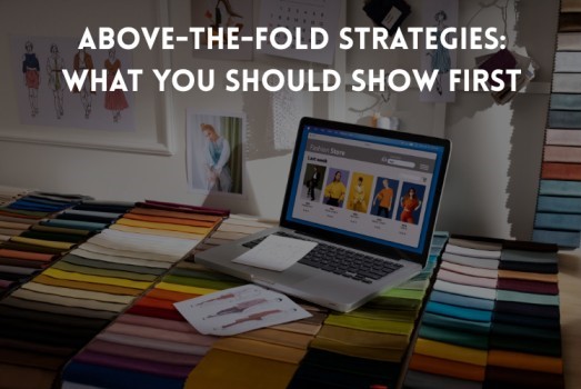
When someone lands on your eCommerce website, what they see before they scroll—commonly referred to as “above the fold”—can make or break their experience. It’s your digital storefront window: a few crucial seconds to deliver value, grab attention, and guide users toward action.

As shopper expectations evolve in 2025, above-the-fold content must do more than look good. It needs to perform. That means faster loading times, clearer messaging, mobile optimization, and smart design that converts.

This guide breaks down what modern brands should prioritize above the fold—and how a skilled eCommerce website design company can help you make every pixel count.

What “Above the Fold” Means in 2025

Originally a newspaper term, “above the fold” refers to what’s visible without unfolding a page. In web design, it means the content users see before scrolling.

But with today’s varied screen sizes—phones, tablets, desktops—the fold isn’t fixed. Designing above-the-fold content now requires flexible layouts, responsive elements, and clear visual hierarchy across devices.

Why It Matters More Than Ever

  • It’s Your First Impression
    Users form opinions in under 3 seconds. If your message isn’t clear, they’ll leave—often before they ever scroll.
  • It Impacts SEO and Engagement
    Google watches bounce rates and time on page. A well-designed first screen encourages interaction, boosting rankings and conversions.
  • It Drives Action
    Want people to shop, sign up, or explore? That journey often begins above the fold.

What to Include Above the Fold in 2025

1. Clear Value Proposition

Your value proposition should immediately answer: What do you offer, and why should I care?

Example:
 “Sustainable Footwear That Looks Good and Feels Better – Free Shipping & Returns.”

Keep it prominent, benefit-driven, and easy to read. Many brands work with a web design company to get this messaging just right.

2. Primary Call-to-Action

Whether it’s “Shop Now” or “Get 10% Off,” your CTA must be visible and compelling.

Best Practices:

  • Use high-contrast, clickable buttons
  • Keep CTA text action-oriented
  • Place it clearly within the first viewport (on desktop and mobile)
  • Avoid clutter around the CTA—white space draws attention naturally

3. Optimized Hero Image or Video

The hero section is the visual anchor of your above-the-fold design.

In 2025, opt for:

  • Lifestyle imagery that reflects your audience
  • Short, muted videos under 2MB
  • Subtle animations to create visual interest
  • Mobile-friendly visuals that don’t slow load times

High-quality visuals boost credibility and drive emotional engagement.

4. Clean Navigation and Accessibility

Above-the-fold design should also offer simple, intuitive navigation.

Checklist:

  • Sticky header with cart and menu icons
  • Mobile-optimized hamburger menu
  • Accessibility features (e.g., keyboard navigation, screen reader support)

A streamlined header helps users explore without confusion.

5. Trust Indicators or Urgency

Add social proof or scarcity elements to increase confidence and drive action.

Examples:

  • “Trusted by 50,000+ Customers”
  • Trust badges (secure checkout, money-back guarantee)
  • Limited-time offer banners like “Sale Ends Tonight”

These can be subtle—avoid overwhelming users with popups or too many badges.

Mobile-First is Mandatory

With over 70% of eCommerce traffic coming from mobile, your design must shine on smaller screens.

Mobile UX Tips:

  • Avoid oversized hero sections that bury the CTA
  • Keep copy scannable—short and punchy
  • Make buttons easy to tap
  • Test on multiple device sizes and browsers

Mobile-first isn’t optional—it’s essential.

What Not to Include Above the Fold

Avoid anything that slows, clutters, or confuses. That includes:

  • Autoplay videos with sound
    Long paragraphs or dense copy
    Multiple competing banners or popups
    Stocky, low-quality imagery

Instead, aim for clarity, speed, and simplicity.

Real-Life Example: Optimizing Above the Fold

A DTC skincare brand revamped their homepage with help from an eCommerce design firm.

Before:

  • Generic hero image
  • No headline or CTA
  • Poor mobile experience

After:

  • Headline: “Clean Skincare Backed by Science”
  • Real user image
  • CTA: “Shop the Collection”
  • Trust badges and free shipping offer

Results:

  • 32% more time on site
  • 19% lower bounce rate
  • 22% more first-click CTA engagement

Strategic changes above the fold led to measurable improvements—without a full redesign.

Key Takeaways for 2025

  • Lead with clarity: Your value prop should be instant and benefit-driven
  • Drive action: Make CTAs bold, simple, and prominent
  • Design for mobile: Responsive layout is a must
  • Use visuals smartly: Quality over quantity
  • Test and improve: Use heatmaps, A/B tests, and session replays to optimize

Final Thoughts

Above-the-fold strategy is no longer a trend—it’s a conversion essential. In 2025, attention spans are shorter, competition is fiercer, and users expect instant clarity.

If you’re unsure how to improve, partnering with an experienced eCommerce web design company can help you align design with performance—turning first impressions into lasting results.

BrainSpate

Leave a Reply

    © 2024 Crivva - Business Promotion. All rights reserved.

    We’ve Cleaned Up 50,000+ Spam Entries — Thank You for Your Support!
    To keep Crivva a valuable platform for everyone, we’ve removed over 50,000 spam tags, comments, and posts in our latest cleanup.

    We urge all members to help us maintain a spam-free community.
    If you find any spammy content or suspicious users — please report them to us.

    Together, let’s build a trusted platform for genuine content and users!
    Is Your WhatsApp Number?*