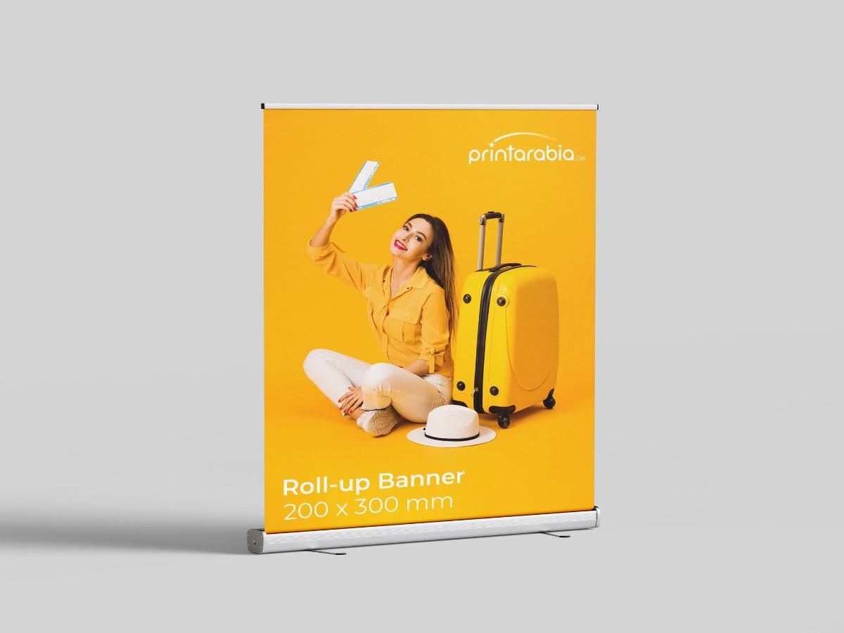


Many roll-up banners fail to attract due to common desgin mistakes. Learn how to fix them and make you next banner work in Dubai.
Walk through any trade show, mall, or exhibition in Dubai, and you’ll spot a roll-up banner at nearly every turn. Some make you stop and take a second look. Others? You barely notice them.
So what separates the eye-catchers from the overlooked?
Often, it’s not about how flashy the banner is, it’s about how well it’s designed. If you’re planning to invest in roll-up banner printing in Dubai, steering clear of a few common mistakes can save you both budget and frustration.
Let’s break down the top design missteps, and how to fix them.
1. Too Much Text, Too Little Clarity
People are busy. They won’t stop to read a paragraph on your banner.
Stick to one clear message. What are you promoting? A discount? A launch? A key benefit? Say that, and say it fast. Use a big headline. Trim the fluff. Think of your roll-up banner as a billboard: you’ve got about three seconds to make it count.
2. Misplaced Content That Doesn’t Get Seen
The top section of your banner is prime space, treat it like a storefront window.
That’s where your logo, main message, and visuals should go. Anything important placed too low is likely to be missed, especially when people are walking by. Always design with eye level in mind, not just aesthetics.
3. Using Low-Quality Images
This one’s a deal-breaker. Blurry photos or pixelated logos will make your brand look unprofessional, no matter how good your product is.
Use high-resolution images that match your banner size. If you’re showing a product, make it sharp, well-lit, and clear. Strong visuals help your banner stand out, especially in busy environments.
4. Ignoring Brand Colors
Going bold with colors might seem like a good idea, but if those colors don’t align with your brand, you’re confusing your audience.
Stick with your brand palette. Consistency builds trust and helps people recognize you faster. If your business uses blue and grey, don’t suddenly throw in orange and pink just to “get attention.” Attention without clarity doesn’t work.
5. Choosing Fancy Fonts That No One Can Read
Your banner is meant to be seen from a distance. That’s why your font choice matters.
Skip script-style or decorative fonts. They’re hard to read fast. Instead, go with clean, bold fonts. Sans-serif fonts like Arial, Helvetica, or Open Sans usually work best. Keep it simple: one font for headings, one for body text, max two.
6. No Clear Call to Action
You’ve got their attention, now what?
Don’t leave people guessing. Every banner needs a clear call to action (CTA). Tell them what to do next:
– Visit our website
– Call this number
– Book your spot
Keep it short, specific, and place it somewhere obvious, often right below the main message or at the bottom.
7. Skipping the Final Design Check
Before you hit print, take a final look.
Step back, literally. Can you read it from a few steps away? Does the message make sense at a glance? Are the images sharp? This small check can save you from printing a banner that doesn’t work, or worse, one that hurts your brand.
If it doesn’t catch your attention from three meters away, it won’t work for anyone else either.
Good design isn’t about cramming in more, it’s about making every element count.
If you’re creating a roll-up banner in Dubai, start with a clear message. Place your content where it gets seen. Use good images. Stick to your branding. And don’t skip the small details.
Need help getting it right? Work with Print Arabia for reliable printing services in Dubai. They flagged design issues before printing, delivered quickly, and made sure we didn’t waste money on banners that wouldn’t work.
So before you print, plan smart. A well-made banner doesn’t just look good. It works.
