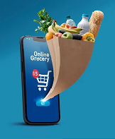


Best Practices for Creating a User-Friendly Supermarket App | Elite mCommerce
Developing an intuitive app for supermarket shopping requires meticulous attention to user-friendly design and seamless functionality. In today’s fast-paced world, customers expect a digital shopping experience that mirrors the convenience of physically visiting a supermarket. A successful app for supermarket users should therefore focus on three key pillars: simple navigation, rapid product searches, and smooth in-app payments. Each of these elements plays a crucial role in creating an app that not only meets user expectations but also enhances their overall shopping experience.
Firstly, navigation is the cornerstone of any supermarket shopping app. Users should be able to easily move through different sections of the app without feeling overwhelmed. To achieve this, it’s essential to prioritize a clean and organized layout. This means clearly defined categories, intuitive menus, and strategically placed buttons that guide users effortlessly from one section to another. The goal is to replicate the intuitive layout of a well-organized supermarket, where customers can find what they need with minimal effort. For example, having clearly labeled sections such as “Fresh Produce,” “Dairy,” and “Beverages” can help users quickly locate the items they’re looking for.
In addition to simple navigation, the app should also facilitate rapid product searches. One of the biggest advantages of shopping online is the ability to quickly find specific products without having to browse through aisles. An effective search function is vital in a supermarket app, allowing users to type in the name of a product and immediately see relevant results. Implementing filters and sorting options can further enhance this feature, enabling users to narrow down their search based on factors like price, brand, or dietary restrictions. This functionality not only saves time but also improves the overall shopping experience by making it more efficient.
Smooth in-app payments are another critical component of a successful supermarket shopping app. The checkout process should be as streamlined as possible to avoid frustration. Users should have multiple payment options, including credit/debit cards, digital wallets, and possibly even cash on delivery, depending on the market. Additionally, incorporating features like saved payment information, one-click purchases, and secure transactions can significantly reduce the time and effort required to complete a purchase. A quicker checkout process not only improves user satisfaction but also reduces the likelihood of cart abandonment.
To further enhance the user experience, consider integrating customized recommendations into the app. By analyzing user behavior and purchase history, the app can suggest products that align with individual preferences. These personalized recommendations can make shopping more enjoyable and convenient, as users are more likely to discover new products that suit their needs. This feature can also boost sales by encouraging users to add more items to their cart.
Lastly, a well-designed app for supermarket use can dramatically boost consumer satisfaction and retention. By focusing on user-friendly design, efficient functionality, and personalized experiences, a supermarket shopping app can become an indispensable tool for customers. When users find the app easy to use and tailored to their preferences, they are more likely to return, leading to increased loyalty and long-term success for the supermarket. In a competitive market, an intuitive and effective app can be the differentiator that sets a supermarket apart from its competitors, ensuring sustained customer engagement and growth.
